| Índice |
|---|
| maxLevel | 4 |
|---|
| outline | true |
|---|
| exclude | .*ndice |
|---|
| style | none |
|---|
|
Objective
The objective of this guide is to detail the configuration procedures of User Experience widgets on Fluig.
Quick Query
 Image Added
Requirements
- To have the user experiences configured.
- Provision of permission on fluig Identity.
Benefits
- Quick access to system contents in typical queries;
- Agility for decision making;
- Single access screen for the user.
'Quick Query' widget settings on fluig
By navigating through the tabs below, follow the step-by-step guide to set up the ‘Quick Query’ widget on fluig.
| Deck of Cards |
|---|
| effectDuration | 0.5 |
|---|
| history | false |
|---|
| id | samples |
|---|
| effectType | fade |
|---|
|
| Card |
|---|
| default | true |
|---|
| id | 1 |
|---|
| label | Step 1 |
|---|
|
 Image Added Image Added
Quick Query widget settings.
|
| Card |
|---|
|
Quick Query widget settings.
|
| Card |
|---|
|
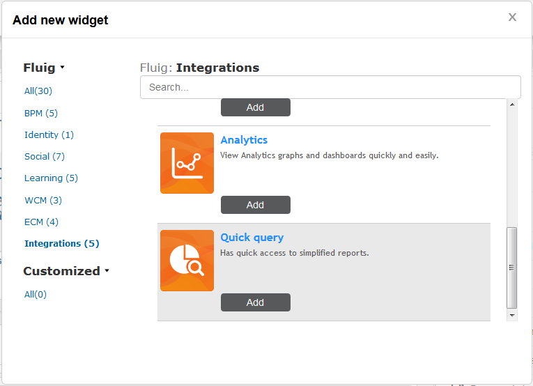
When adding the widget, fluig detects the related ERP companies through fluig Identity. We will setup the widget to return a simplified report of orders per item from the ‘Matriz’. - Title: Pedidos por item - Quick query: PEDIDOS POR ITEM - Company: Matriz
 Image Added Image Added
Quick Query widget settings.
|
| Card |
|---|
|
- Next, click Save and post the widget editing on the page.
 Image Added Image Added
Quick Query widget settings.
|
| Card |
|---|
|
- When viewing the page, the quick query report will be displayed.
- If necessary, access the widget help feature through the question mark icon in the upper right corner.
Image Added Quick Query widget settings.
|
|
Analytics
Image Added
Requirements
- fluig integrated with Identity
Analytics app configured
Benefits
- Dynamic dashboards;
- Analysis data used where necessary;
- Shared access with user profiles;
- New views within minutes.
'Analytics' widget settings on Fluig
By navigating through the tabs below, follow the step-by-step guide for the setup of the ‘Analytics’ widget on Fluig.
| Deck of Cards |
|---|
| effectDuration | 0.5 |
|---|
| history | false |
|---|
| id | samples |
|---|
| effectType | fade |
|---|
|
| Card |
|---|
| default | true |
|---|
| id | 1 |
|---|
| label | Step 1 |
|---|
|
Image Added Analytics Widget Settings.
|
| Card |
|---|
| On the screen to add widgets, the integration filter sorts out widgets related to user experiences. In this example, we will add the Analytics widget that allows viewing charts and dashboards from Analytics more easily and quickly.
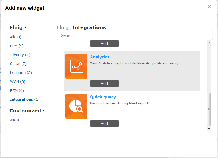 Image Added Image Added
Analytics Widget Settings.
|
| Card |
|---|
| After adding the widget to the page, setup data must be entered in order for the widget to display the graphics of the fluig Analytics or TOTVS Analytics project. Enter the desired name of the Analytics widget in the Title. In the example below, the report relates to the most accessed communities, which is why the widget title is “TOP - Communities”.
Image Added Analytics Widget Settings.
- The URL field refers to the report URI in Analytics. To obtain this information, access Analytics and browse to the graphic to be added to the platform. Click “Embed”, copy the URI field content and paste it on the URL field of the widget settings.
 Image AddedStep-by-step instructions Image AddedStep-by-step instructions - To do so, go to the Applications menu and filter by the GoodData apps. Go to the GoodData app properties configured in Identity with the Fluig/TOTVS Analytics project and click the More information option. A window will be shown with the application code. This code must be copied and pasted into the Application Code field in the widget settings. Image AddedStep-by-step instructions
|
| Card |
|---|
| - Next, click Save and post the widget editing on the page.
Image Added Analytics Widget Settings.
|
| Card |
|---|
| - When viewing the page, the fluig Analytics chart will be displayed.
- If necessary, access the widget help feature through the question mark icon in the upper right corner.
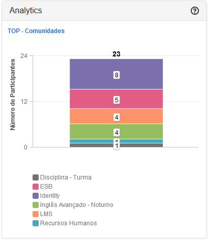 Image Added Image Added
|
|
Centralized access
Image Added
Requirements
- To have the user experiences configured.
- Provision of permission on Identity.
Benefits
- Enabled view of routines
- Access in local environments and in the cloud
- Creation of list of routines related to a context
‘Centralized access' widget settings on TOTVS Fluig
By navigating through the tabs below, follow the step-by-step guide for the setup of the ‘Centralized Access’ widget on fluig.
| Deck of Cards |
|---|
| effectDuration | 0.5 |
|---|
| history | false |
|---|
| id | samples |
|---|
| effectType | fade |
|---|
|
| Card |
|---|
| default | true |
|---|
| id | 1 |
|---|
| label | Step 1 |
|---|
|
Image Added Centralized Access Widget Settings
|
| Card |
|---|
|
On the screen to add widgets, the integration filter sorts out widgets related to user experiences. In this example, we will add a Centralized access widget that allows easy access to fluig-integrated system routines.
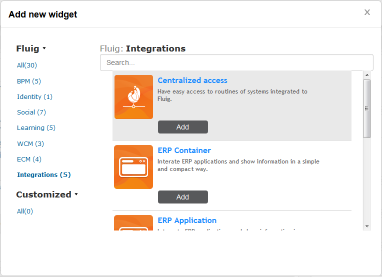 Image Added Image Added
Centralized Access Widget Settings.
|
| Card |
|---|
|
When adding the widget, fluig detects the related ERP companies through fluig Identity. We will configure the title of the widget as 'Routines' and we will display the 'complete' menu configured in ERP. - The following types of menu can be configured for centralized access: Complete, Favorites, Most accessed and Custom List.
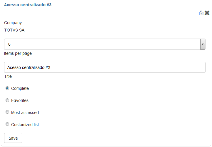 Image Added Image Added
Centralized Access Widget settings.
The following behaviors are created for each type: - Full: displays all user Menu routines in the selected company.
- Favorites: displays all user Menu routines in the company selected that were marked as favorites.
- Most accessed: displays the routines sorted from most accessed to least accessed.
- Custom list: allows the page administrator to select from a list the routines that will be displayed to users
|
| Card |
|---|
|
- Next, click Save and post the widget editing on the page.
Image Added Centralized Access Widget settings.
|
| Card |
|---|
|
- When viewing the page, the menu will be displayed.
- If necessary, access the widget help feature through the question mark icon in the upper right corner.
Image Added Centralized Access Widget settings. |
|
| HTML |
|---|
|
<div id="main-content" class="wiki-content group">
<h1 id="WidgetsdeExperiênciadeUso-Índice">Contents</h1>
<p>
<style type='text/css'>/*<![CDATA[*/
div.rbtoc1412695932449 {
padding: 0px;
}
div.rbtoc1412695932449 ul {
list-style: none;
margin-left: 0px;
}
div.rbtoc1412695932449 li {
margin-left: 0px;
padding-left: 0px;
}
/*]]>*/
</style>
<div class='toc-macro rbtoc1412695932449'>
<ul class='toc-indentation'>
<li><span class='TOCOutline'>1</span> <a
href='#WidgetsdeExperiênciadeUso-Objetivo'>Objective</a></li>
<li><span class='TOCOutline'>2</span> <a
href='#WidgetsdeExperiênciadeUso-ConsultaRápida'>Quick Query</a>
<ul class='toc-indentation'>
<li><span class='TOCOutline'>2.1</span> <a
href='#WidgetsdeExperiênciadeUso-Requisitos'>Requirements</a></li>
<li><span class='TOCOutline'>2.2</span> <a
href='#WidgetsdeExperiênciadeUso-Benefícios'>Benefits</a></li>
<li><span class='TOCOutline'>2.3</span> <a
href='#WidgetsdeExperiênciadeUso-Configuraçãodowidget'ConsultaRápida'noFluig'>Configuration
of 'Quick Query' widget on Fluig</a></li>
</ul></li>
<li><span class='TOCOutline'>3</span> <a
href='#WidgetsdeExperiênciadeUso-Analytics'>Analytics</a>
<ul class='toc-indentation'>
<li><span class='TOCOutline'>3.1</span> <a
href='#WidgetsdeExperiênciadeUso-Requisitos.1'>Requirements</a></li>
<li><span class='TOCOutline'>3.2</span> <a
href='#WidgetsdeExperiênciadeUso-Benefícios.1'>Benefits</a></li>
<li><span class='TOCOutline'>3.3</span> <a
href='#WidgetsdeExperiênciadeUso-Configuraçãodowidget'Analytics'noFluig'>Configuration
of 'Analytics' widget on Fluig</a></li>
</ul></li>
<li><span class='TOCOutline'>4</span> <a
href='#WidgetsdeExperiênciadeUso-AcessoCentralizado'>Centralized
access</a>
<ul class='toc-indentation'>
<li><span class='TOCOutline'>4.1</span> <a
href='#WidgetsdeExperiênciadeUso-Requisitos.2'>Requirements</a></li>
<li><span class='TOCOutline'>4.2</span> <a
href='#WidgetsdeExperiênciadeUso-Benefícios.2'>Benefits</a></li>
<li><span class='TOCOutline'>4.3</span> <a
href='#WidgetsdeExperiênciadeUso-Configuraçãodowidget'AcessoCentralizado'noFluig'>Configuration
of 'Centralized access' widget on Fluig</a></li>
</ul></li>
</ul>
</div>
</p>
<p> </p>
<h1 id="WidgetsdeExperiênciadeUso-Objetivo">Objective</h1>
<p>
The objective of this guide is to detail configuration procedures of
User experience <em>widgets</em> on Fluig.
</p>
<p> </p>
<h1 id="WidgetsdeExperiênciadeUso-ConsultaRápida">Quick Query</h1>
<p>
<img class="confluence-embedded-image"
src="attachments/149880912/150110302.png"
data-image-src="attachments/149880912/150110302.png">
</p>
<h3 id="WidgetsdeExperiênciadeUso-Requisitos">Requirements</h3>
<ul>
<li>To have the user experiences configured.</li>
<li>Provision of permission on Identity.</li>
</ul>
<p> </p>
<h3 id="WidgetsdeExperiênciadeUso-Benefícios">Benefits</h3>
<ul>
<li>Quick access to system contents in typical queries;</li>
<li>Agility for decision making;</li>
<li>Single access screen for the user.</li>
</ul>
<p> </p>
<h3
id="WidgetsdeExperiênciadeUso-Configuraçãodowidget'ConsultaRápida'noFluig">
Configuration of 'Quick Query' <em>widget</em> on Fluig
</h3>
<p>Follow, by navigating through the tabs below, the step-by-step
guide for the configuration of ‘Quick Query’ widget on Fluig.</p>
<p style="text-align: left;"> </p>
<a name="composition-deck-samples"></a>
<div id="samples" class="deck" history="false" loopcards="false"
effecttype="fade" effectduration="0.5" nextafter="0.0">
<ul class="tab-navigation"></ul>
<!-- // .tab-navigation -->
<div class="deck-cards panel" style="">
<div id="1" class="deck-card active-pane" style="" cssclass=""
accesskey="" label="Passo1" title="" nextafter="0"
effecttype="default" effectduration="-1.0">
<p> </p>
<ul>
<li><p>
At the editing of the page where the <em>widget</em> will be
added, click 'Add New Widget' to add the <em>widget</em> to the
slot.
</p></li>
</ul>
<p> </p>
<p>
<img class="confluence-embedded-image image-center"
src="attachments/149880912/150110226.png"
data-image-src="attachments/149880912/150110226.png">
</p>
<p style="text-align: center;">
<strong style="text-align: center;">Figure 1 -
Configuration of the Quick Query <em>widget</em>.
</strong>
</p>
<p style="text-align: center;"> </p>
</div>
<div id="2" class="deck-card " style="" cssclass="" accesskey=""
label="Passo 2" title="" nextafter="0" effecttype="default"
effectduration="-1.0">
<p> </p>
<div>
<ul>
<li><p>On the screen to add widgets, the integration
filter sorts out widgets related to user experiences. In this
example we will add a Quick Query widget that allows rapid
access to simplified reports.</p>
<p>
<br />
<img class="confluence-embedded-image image-center"
src="attachments/149880912/150110228.png"
data-image-src="attachments/149880912/150110228.png">
</p></li>
</ul>
<p style="text-align: center;">
<strong style="text-align: center;">Figure 2 -
Configuration of the Quick Query <em>widget</em>.
</strong>
</p>
<p style="text-align: center;">
<strong style="text-align: center;"><br /></strong>
</p>
</div>
</div>
<div id="3" class="deck-card " style="" cssclass="" accesskey=""
label="Passo 3" title="" nextafter="0" effecttype="default"
effectduration="-1.0">
<p> </p>
<ul>
<li><p>
When adding the <em>widget</em> Fluig detects the ERP companies
related through Fluig Identity.
</p></li>
</ul>
<ul>
<li><p>
We will configure the <em>widget</em> to return a simplified
report of orders per item from a company called 'Head Office'.
</p>
<p>
<strong>- Title:</strong> Orders per item
</p>
<p>
<strong>- Quick query:</strong> ORDERS PER ITEM
</p>
<p>
<strong>- Company:</strong> Head Office
</p></li>
</ul>
<p> </p>
<p>
<img class="confluence-embedded-image image-center" width="500"
src="attachments/149880912/150110229.png"
data-image-src="attachments/149880912/150110229.png">
</p>
<p style="text-align: center;">
<strong style="text-align: center;">Figure 3 -
Configuration of the Quick Query <em>widget</em>.
</strong>
</p>
<p style="text-align: center;">
<strong><br /></strong>
</p>
</div>
<div id="4" class="deck-card " style="" cssclass="" accesskey=""
label="Passo 4" title="" nextafter="0" effecttype="default"
effectduration="-1.0">
<p> </p>
<ul>
<li>Next, click Save and post the widget editing on the page.</li>
</ul>
<p> </p>
<p>
<img class="confluence-embedded-image image-center"
src="attachments/149880912/150110232.png"
data-image-src="attachments/149880912/150110232.png">
</p>
<p style="text-align: center;">
<strong style="text-align: center;">Figure 4 -
Configuration of the Quick Query <em>widget</em>.
</strong>
</p>
<p style="text-align: center;">
<strong style="text-align: center;"><br /></strong>
</p>
</div>
<div id="5" class="deck-card " style="" cssclass="" accesskey=""
label="Passo 5" title="" nextafter="0" effecttype="default"
effectduration="-1.0">
<p> </p>
<ul>
<li>When viewing the page, the quick query report will be
displayed.</li>
</ul>
<p> </p>
<p>
<img class="confluence-embedded-image image-center" width="500"
src="attachments/149880912/150110233.png"
data-image-src="attachments/149880912/150110233.png">
</p>
<p style="text-align: center;">
<strong style="text-align: center;">Figure 5 -
Configuration of the Quick Query <em>widget</em>.
</strong>
</p>
<p style="text-align: center;">
<strong style="text-align: center;"><br /></strong>
</p>
</div>
</div>
</div>
<!-- // .deck -->
<p style="text-align: left;"> </p>
<p style="text-align: left;"> </p>
<h1 id="WidgetsdeExperiênciadeUso-Analytics">Analytics</h1>
<p>
<img class="confluence-embedded-image"
src="attachments/151617565/151192247.png"
data-image-src="http://tdn.totvs.com/download/attachments/151617565/widget_analytics.png?version=1&modificationDate=1406892783000&api=v2">
</p>
<h3 id="WidgetsdeExperiênciadeUso-Requisitos.1">Requirements</h3>
<ul>
<li><span>Fluig integrated with Identity</span></li>
<li><p>Analytics app configured</p></li>
</ul>
<p> </p>
<h3 id="WidgetsdeExperiênciadeUso-Benefícios.1">Benefits</h3>
<ul>
<li>Dynamic dashboards;</li>
<li>Analysis data used where necessary;</li>
<li>Shared access with user profiles;</li>
<li>New views within minutes.</li>
</ul>
<p> </p>
<h3
id="WidgetsdeExperiênciadeUso-Configuraçãodowidget'Analytics'noFluig">
Configuration of 'Analytics' <em>widget</em> on Fluig
</h3>
<p>Follow, by navigating through the tabs below, the step-by-step
guide for the configuration of the Analytics widget on Fluig.</p>
<p> </p>
<a name="composition-deck-samples"></a>
<div id="samples" class="deck" history="false" loopcards="false"
effecttype="fade" effectduration="0.5" nextafter="0.0">
<ul class="tab-navigation"></ul>
<!-- // .tab-navigation -->
<div class="deck-cards panel" style="">
<div id="1" class="deck-card active-pane" style="" cssclass=""
accesskey="" label="Passo1" title="" nextafter="0"
effecttype="default" effectduration="-1.0">
<p> </p>
<ul>
<li><p>
At the editing of the page where the <em>widget</em> will be
added, click 'Add New Widget' to add the <em>widget</em> to the
slot.
</p></li>
</ul>
<p> </p>
<p>
<img class="confluence-embedded-image image-center"
src="attachments/151617565/151192256.png"
data-image-src="http://tdn.totvs.com/download/attachments/151617565/novaWidget.PNG?version=1&modificationDate=1406892783000&api=v2">
</p>
<p style="text-align: center;">
<strong>Figure 6 - Configuration of the Analytics <em>widget</em>.
</strong>
</p>
<p style="text-align: center;"> </p>
</div>
<div id="2" class="deck-card " style="" cssclass="" accesskey=""
label="Passo 2" title="" nextafter="0" effecttype="default"
effectduration="-1.0">
<p> </p>
<div>
<ul>
<li><p>
On the screen to add widgets, the integration filter sorts out
widgets related to user experiences. In this example, we will
add the <em>Analytics widget</em> <span>that allows to
view graphics and <em>dashboards</em> from <em>Analytics</em>
more easily and quickly.
</span>
</p>
<p>
<br />
<img class="confluence-embedded-image image-center"
src="attachments/151617565/151192246.png"
data-image-src="http://tdn.totvs.com/download/attachments/151617565/Capturar.PNG?version=1&modificationDate=1406892783000&api=v2">
</p></li>
</ul>
<p style="text-align: center;">
<strong>Figure 7 - Configuration of the Analytics <em>widget</em>.
</strong>
</p>
<p style="text-align: center;">
<strong><br /></strong>
</p>
</div>
</div>
<div id="3" class="deck-card " style="" cssclass="" accesskey=""
label="Passo 3" title="" nextafter="0" effecttype="default"
effectduration="-1.0">
<p> </p>
<ul>
<li><p>
When adding the <em>widget</em> Fluig detects the ERP companies
related through Fluig Identity.
</p></li>
</ul>
<p> </p>
<ul>
<li><p>
<span>We will inform the title of the widget as 'TOP -
Communities' and, after configuration, the analysis graph of the
most accessed communities by the company on Fluig will be
displayed.</span>
</p></li>
</ul>
<ul>
<li><p>For this widget, it is necessary to configure the
fields, title, URL, application, height and width.</p></li>
</ul>
<p>
<img class="confluence-embedded-image image-center"
src="attachments/151617565/151192245.png"
data-image-src="http://tdn.totvs.com/download/attachments/151617565/03.PNG?version=1&modificationDate=1406892783000&api=v2">
</p>
<p style="text-align: center;">
<strong>Figure 8 - Configuration of the Analytics <em>widget</em>.
</strong>
</p>
<p style="text-align: center;">
<strong><br /></strong>
</p>
<p>
<strong><br /></strong>
</p>
<ul>
<li>The URL refers to the <em>Embedded URL</em> of the graph
on the <em>Analytics</em> to be viewed on Fluig. This URL is
obtained when accessing <em>Analytics</em>. In the graph to be
viewed, click on <em>"Embed"</em> at the bottom of the graph:
</li>
</ul>
<p style="text-align: center;"> </p>
<p style="text-align: center;">
<img class="confluence-embedded-image" width="500"
src="attachments/151617565/151192244.png"
data-image-src="http://tdn.totvs.com/download/attachments/151617565/analytics01.PNG?version=1&modificationDate=1406892783000&api=v2">
</p>
<p style="text-align: center;">
<strong>Figure 9 - Configuration of the Analytics <em>widget</em>.
</strong>
</p>
<p style="text-align: left;"> </p>
<ul>
<li style="text-align: left;">Next, copy the URL segment for
the <em>Analytics</em> graph to enter it on the URL field of the <em>widget</em>
on Fluig.
</li>
</ul>
<p style="text-align: left;"> </p>
<p>
<img class="confluence-embedded-image image-center" width="500"
src="attachments/151617565/151192243.png"
data-image-src="http://tdn.totvs.com/download/attachments/151617565/analytics02.PNG?version=1&modificationDate=1406892783000&api=v2">
</p>
<p style="text-align: center;">
<strong>Figure 10 - Configuration of the Analytics <em>widget</em>.
</strong>
</p>
<p> </p>
</div>
<div id="4" class="deck-card " style="" cssclass="" accesskey=""
label="Passo 4" title="" nextafter="0" effecttype="default"
effectduration="-1.0">
<p> </p>
<ul>
<li>Next, click Save and post the widget editing on the page.</li>
</ul>
<p> </p>
<p>
<img class="confluence-embedded-image image-center"
src="attachments/151617565/151192253.png"
data-image-src="http://tdn.totvs.com/download/attachments/151617565/menu.PNG?version=1&modificationDate=1406892783000&api=v2">
</p>
<p style="text-align: center;">
<strong>Figure 11 - Configuration of the Analytics <em>widget</em>.
</strong>
</p>
<p style="text-align: center;">
<strong><br /></strong>
</p>
</div>
<div id="5" class="deck-card " style="" cssclass="" accesskey=""
label="Passo 5" title="" nextafter="0" effecttype="default"
effectduration="-1.0">
<p> </p>
<ul>
<li>When viewing the page, the Fluig <em>Analytics</em> graph
will be displayed.
</li>
</ul>
<p style="text-align: center;">
<strong><br /></strong>
</p>
</div>
</div>
</div>
<!-- // .deck -->
<p> </p>
<p style="text-align: left;"> </p>
<h1 id="WidgetsdeExperiênciadeUso-AcessoCentralizado">Centralized
access</h1>
<p style="text-align: left;">
<img class="confluence-embedded-image"
src="attachments/149880912/150110303.png"
data-image-src="attachments/149880912/150110303.png">
</p>
<h3 id="WidgetsdeExperiênciadeUso-Requisitos.2">Requirements</h3>
<ul>
<li>To have the user experiences configured.</li>
<li>Provision of permission on Identity.</li>
</ul>
<p style="text-align: left;"> </p>
<h3 id="WidgetsdeExperiênciadeUso-Benefícios.2">Benefits</h3>
<ul>
<li>Enabled view of routines</li>
<li>Access in local environments and in the cloud</li>
<li>Creation of routine lists related to a context</li>
</ul>
<p style="text-align: left;"> </p>
<h3
id="WidgetsdeExperiênciadeUso-Configuraçãodowidget'AcessoCentralizado'noFluig">
Configuration of 'Centralized access' <em>widget</em> on Fluig
</h3>
<p>Follow, by navigating through the tabs below, the step-by-step
guide for the configuration of ‘Quick Query’ widget on Fluig.</p>
<p style="text-align: left;"> </p>
<a name="composition-deck-samples"></a>
<div id="samples" class="deck" history="false" loopcards="false"
effecttype="fade" effectduration="0.5" nextafter="0.0">
<ul class="tab-navigation"></ul>
<!-- // .tab-navigation -->
<div class="deck-cards panel" style="">
<div id="1" class="deck-card active-pane" style="" cssclass=""
accesskey="" label="Passo1" title="" nextafter="0"
effecttype="default" effectduration="-1.0">
<p> </p>
<ul>
<li><p>
At the editing of the page where the <em>widget</em> will be
added, click 'Add New Widget' to add the <em>widget</em> to the
slot.
</p></li>
</ul>
<p> </p>
<p>
<img class="confluence-embedded-image image-center"
src="attachments/149880912/150110226.png"
data-image-src="attachments/149880912/150110226.png">
</p>
<p style="text-align: center;">
<strong>Figure 13 - Configuration of the Centralized
access <em>widget</em>.
</strong>
</p>
<p style="text-align: center;"> </p>
</div>
<div id="2" class="deck-card " style="" cssclass="" accesskey=""
label="Passo 2" title="" nextafter="0" effecttype="default"
effectduration="-1.0">
<p> </p>
<div>
<ul>
<li><p>On the screen to add widgets, the integration
filter sorts out widgets related to user experiences. In this
example we will add a Centralized access widget that allows easy
access to system routines integrated to Fluig.</p>
<p>
<br />
<img class="confluence-embedded-image image-center"
src="attachments/149880912/150110283.png"
data-image-src="attachments/149880912/150110283.png">
</p></li>
</ul>
<p style="text-align: center;">
<strong>Figure 14 - <strong style="text-align: center;">Configuration
of the Centralized access <em>widget</em>.
</strong></strong>
</p>
<p style="text-align: center;">
<strong><br /></strong>
</p>
</div>
</div>
<div id="3" class="deck-card " style="" cssclass="" accesskey=""
label="Passo 3" title="" nextafter="0" effecttype="default"
effectduration="-1.0">
<p> </p>
<ul>
<li><p>
<span style="color: rgb(51, 51, 51);">When adding the <em>widget</em>,
Fluig detects the ERP companies related through Fluig Identity.
</span>
</p></li>
</ul>
<ul>
<li><p>
<span style="color: rgb(51, 51, 51);">We will configure
the title of the widget as 'Routines' and we will display the
'complete' menu configured in ERP.</span>
</p>
<p>
<span style="color: rgb(51, 51, 51);"><strong>- </strong></span>The
following types of menu can be configured for centralized access:
</p>
<p>
<span style="color: rgb(51, 51, 51);"><strong>Complete,
Favorites, Most accessed and Custom List.</strong></span>
</p></li>
</ul>
<p> </p>
<p>
<img class="confluence-embedded-image image-center"
src="attachments/149880912/150110298.png"
data-image-src="attachments/149880912/150110298.png">
</p>
<p style="text-align: center;">
<strong>Figure 15 - <strong style="text-align: center;">Configuration
of the Centralized access <em>widget</em>.
</strong></strong>
</p>
<p style="text-align: center;">
<strong><br /></strong>
</p>
</div>
<div id="4" class="deck-card " style="" cssclass="" accesskey=""
label="Passo 4" title="" nextafter="0" effecttype="default"
effectduration="-1.0">
<p> </p>
<ul>
<li>Next, click Save and post the widget editing on the page.</li>
</ul>
<p> </p>
<p>
<img class="confluence-embedded-image image-center"
src="attachments/149880912/150110232.png"
data-image-src="attachments/149880912/150110232.png">
</p>
<p style="text-align: center;">
<strong>Figure 16 - <strong style="text-align: center;">Configuration
of the Centralized access <em>widget</em>.
</strong></strong>
</p>
<p style="text-align: center;">
<strong><br /></strong>
</p>
</div>
<div id="5" class="deck-card " style="" cssclass="" accesskey=""
label="Passo 5" title="" nextafter="0" effecttype="default"
effectduration="-1.0">
<p> </p>
<ul>
<li>When viewing the page, the menu will be displayed.</li>
</ul>
<p>
<img class="confluence-embedded-image image-center"
src="attachments/149880912/150110300.png"
data-image-src="attachments/149880912/150110300.png">
</p>
<p style="text-align: center;">
<strong>Figure 17 - <strong style="text-align: center;">Configuration
of the Centralized access <em>widget</em>.
</strong></strong>
</p>
<p style="text-align: center;">
<strong><br /></strong>
</p>
</div>
</div>
</div>
<!-- // .deck -->
<p> </p>
<p>
<strong style="text-align: center;"><br /></strong>
</p>
<p style="text-align: left;">
<strong style="text-align: center;"><br /></strong>
</p>
<p style="text-align: left;">
<strong style="text-align: center;"><br /></strong>
</p>
</div>
|